What Are Landing Pages Anyway?
A landing page is the destination for other marketing efforts and is designed to accomplish a specific business goal and objective; such as to signup, purchase, download or contact.
Landing pages became popular around 2011 as marketers were looking to increase conversion rates on their ad traffic. With the rise of social media platforms, marketers needed a way to capitalize on their social traffic to get their audience off of the social media platforms and onto their web pages.
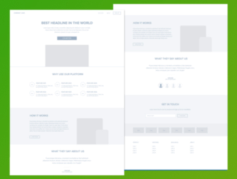
The most common type of landing pages focused on email list sign-ups or selling products. They usually have a headline, value prop copy, and a clear call to action. Landing pages are often called “sales pages” when selling products or “opt-in” pages when driving email list signups.
As the growth of the landing page idea grew, so did landing page tool services. These services provide drag-and-drop landing page builders and have 3rd party integrations with shopping cart software and email autoresponders.
Because the functionality drives leads and sales for a business, landing pages are an essential tool for all marketers.
How to build and design high converting landing pages
 You should use your landing page(s) for one reason for one specific audience in mind. In most cases you should tell them what you have to offer, how it helps them, why they should trust you, what benefits they get, how much it costs them.
That’s it. The secret to a converting landing page.
Except the art and the science are is all in the details. Being able to clearly articular what you have to offer the visitor is the most important, this is why copy is such an important part of the landing page process.
Tips on building landing pages
- Use Cialdini’s 6 principles of influence in your landing pages
- Understand the cognitive biases in humans
- Use design principles of color and white space to your advantage
- Know how a visitor will see your page
- Use primal urges in your market to get them to take action
Von Restorff Effect
This bias states that we tend to remember things that stand out. It can be the background image of your landing page or the CTA (call to action) button.
The Deictic Gaze
Our bias to look at an object when we see someone else looking at the object is embedded firmly into our brains. Image seeing a group of people on the street sharing a photo and laughing boastfully. You now want to see what is so funny in this picture and wish you could see it. This is the Deictic Gaze in action.
Picture Superiority Effect
Pictures are superior to copy when it comes to landing page conversions. People tend to understand complex concepts and recall them more easily when they are displayed as images compared to words.
Make sure to include relevant images on your post-click landing pages so you help your visitors understand your offer better.
Adding images alongside useful copy will increase clicks on your CTA button.
Focusing Effect
The focusing effect is a bias people have to put one important aspect of an event above all others.
Successful landing page marketers use this cognitive bias to their advantage by having visitors focus on their USP (unique selling proposition).
While your product or service has a list of benefits and features, when you highlight just one USP more than other benefits, humans will anchor themselves to the statement, and this anchoring allows them to click on your CTA button.
The F-Pattern
The F-pattern bias is also known as the “fast pattern” which is named based on the visitor’s eye scans a new webpage in the shape of a capital F.
This eye-tracking study was done by the Neilson Norman Group and found the reading method resembled the letter F had the following components:
- Users first read a horizontal line, starting from the upper left of the content.
- Next, users moved their eyes down the left side of the page, seeking the more compelling horizontal copy.
- In the end, visitors scan all the way down the left side of the page horizontally.
Now you know how people will scan your pages, you will use this to your advantage when writing long sales pages.
This bias also works on short post-click pages, especially for the content above the fold.
The Z-Pattern
Z Pattern, while similar to the F Pattern, is the way a visitor views a page.
F Pattern is more relevant to pages with a lot of copy and the Z Pattern is meant more for pages that contain only a little copy.
Z Pattern bias states the visitor starts from the upper left corner of the page and does a quick scan across the top from left to right.
Next, the users look back left and down the page diagonally.
In the end, the visitor’s line of sight is taken again in a horizontal line from left to right.
Once you know these persuasion principles and cognitive biases you become a deadly ninja marketer.
Successful landing page designers use these psychological methods like writing great poetry.
Now that you know the guiding principles you can play with your traffic, let’s talk about the different elements of your landing pages that will work together to create beautiful music in your prospect’s minds.
17 Tips To Optimize Your Landing Pages in 2020
Now you know the “scientific” principles and psychology behind the best converting landing pages, let’s delve deeper into the mechanics of designing successful landing page “art”.
Create a Great Headline
- Compelling adjectives; words like “shocking”, “astounding”, or “sensational” tend to draw readers in.
- Create a common enemy; the “us vs. them” unity is a shared sense of values that works subconsciously to gain trust.
- Be honest; no matter what your keyword or headline says, make sure your content matches it or you will lose all trust.
- Be controversial; making a bold statement and challenging your visitor’s long-held beliefs is a pattern interrupt that will garner their attention.
Create a Sense of Urgency
Use Design Elements
- Color – knowing color psychology is an important tool in every designer’s toolbelt.
- Whitespace – “Do more with less” is what working with whitespace does for you. You can emphasize certain elements of your page and make it easier to read at the same time.
- Imagery – Strong imagery that speaks to your visitor’s emotions can get them to take action as well as giving them some room to read your copy.
- Video – Using a video on your PPC landing pages can increase conversions by over 80% but few companies use this extremely effective tool.
Use Color Theory
- Complementary – two colors that are on the opposite sides of the color wheel. Together these two colors will appear more bright and prominent.
- Monochromatic – These are three shades, tones, or tints of one base color. When you put them together in the right combination they show a harmonious, in sync look.
- Analogous – Three colors that are side by side on the color wheel. While this combination is versatile, it can also be overwhelming. To use this method, choose one dominant color and use the others as color accents.
- Triadic – These are three colors that are evenly spaced on a color wheel. It provides a high contrast color scheme. This color combination creates bold, vibrant color palettes.
- Tetradic – These are four colors evenly spaced on a color wheel. You should choose one dominant color and let the rest be accent colors.
Improve Page Load Time
Did you know 70% of consumers admit that page loading time influences their desire to buy according to Unbounce’s Page Speed Report for Marketers?
If your landing pages are taking more than three seconds to load, you may be losing customers.
Do not bog down your page with unnecessary elements and make sure all of your images are optimized using Google’s speed recommendations.
You may also want to consider using Google’s Accelerated Mobile Pages (AMP) to deliver near-instant speeds.
Include Social Proof
Design for the device
Design your landing pages for people on the go.
Using a mobile responsive version of your page means it will be less interactive and some images can be shrunk or removed completely.
Use Clear Copy
Keep action above the fold
The term “above the fold” means the information on a landing page that is visible when it loads, without having to scroll down.
It is the most valuable real estate on your entire page.
Do one job
Good copy should be clear and straightforward. It should be like reading the back of a cereal box.
Use an FK (Flesch Kincaid) readability score generator to get your copy to read as easy as possible.
Always Be Testing
Control reader attention
Use Benefits Not Features
Use Video
Say “Thank You”
Avoid manual entry
Multiple-choice questions are easier to answer than manual entry responses simply because choosing one option from a list of five is less taxing than entering their own answer manually.
This little trick will lead to more conversions and it will make an analysis of market research much easier.
